Showing posts with label Before and After. Show all posts

Thursday, February 2, 2012

Before and After - Dining Room

Since I never planned to start a home blog, I didn't plan on taking 'before' pictures of each room.  Unfortunately, this is the best picture I have found to show the room that is now our dining room.  It is a small room (approximately 9 1/2'-x-11') that is adjacent to, and open to, the front living room.  Originally (as shown in the picture below), we had this room as the study/office, but we couldn't really ever get much work done since it was open to the living room (and thus the TV).  

OMG, this picture!  The decor is horrendous - a stuffed duck "flying" on the wall, a TV randomly placed in between the two rooms and on a particle-board TV stand, and I think I spy a huge, overstuffed aqua leather chair in the corner...


So much better!  I wanted to make the one full wall stand out and I found this idea for an easy wall treatment on Little Green Notebook.  I love how it mimics wallpaper but without all the fuss and mess.  Plus it's easily removable without leaving any damage to the walls!  


{the view of the dining room from the kitchen}


{the view of the dining room from the living room}

We still have some design work to finish up before the dining room is completely finished:
  •   I've bought a drum pendant chandelier to replace the ceiling fan, but I'm still waiting on Handy Andy (i.e. my husband Andrew) to hang it for me.  When it's hung, it will block the view of the sunburst mirror, so I think I'm going to buy another one and hang them on the wall on either side of the chandelier.
  • We already owned the dark brown leather parsons chairs and they are filling in at the heads of the table until I find the right chairs.  
  • I'm also on the look out for a great rug to put underneath the table to infuse a little warmth and texture into a room with lots of hard lines.  
  • And lastly, I need to style the table with more than just a runner.  

Before and After - Kitchen

Seriously, when I look back at these pictures I wonder why we ever bought this house.  It was ug-ly!  Anyway, here is what our kitchen space looked like when we moved into our house in 2007:


{the view into the kitchen from the then dining room, looking at the side of the fridge}


{the awkward placement of the fridge partially hid the window that looked into the carport and it's horribly broken mini blind}


{white cabinets, white laminate countertops and backsplash, linoleum tile flooring, gold cabinet hardware}


{the one saving grace of the kitchen - stainless appliances}

Over the years, I painted the kitchen several colors, including a bold red (which I am embarrassed to even admit) and then blue (which looked a lot lighter on the paper swatch than it turned out).


I love to cook and spend a large chunk of time each day in the kitchen, so when we pulled our house off the market, I knew we had to do some updating/remodeling to make the kitchen a better space.  Our kitchen's layout is anything but ordinary due to an addition that was built at some point.  While we would have loved to have torn out the entire kitchen, office nook and laundry room to create an amazing open kitchen, we had a budget to stick to.  That plan would have forced us to move waterlines (and with a concrete slab that more expensive), buy all new cabinetry, alter/raise the roofline, even the flooring (the laundry room is slightly sunken) and could easily have cost upwards of $30,000.  So with our budget in mind, here's what we came up with:


We painted the kitchen a warm tan that coordinated well with the tile and natural stone backsplash and granite countertops.  In order to keep the costs down, we opted to keep the cabinets since we were fairly new and still in good condition.  As with the family room, we ripped up the linoleum tile floor and had engineered wood floors laid.


{a view of the prep side of the kitchen, FYI - the granite isn't as gold in real-life as it appears in pictures}


We removed the random window which looked into the carport and re-oriented the position of the fridge so that you see the front rather than the side.  Still left to do, we're going to add narrow cabinets to the right of and above the fridge to create a pantry.  This will give us more storage (sweet!) and make the fridge look like it's built-in versus randomly stuck on a wall by itself.


We also created an arched doorway (which matches the one from the living room into the hallway) so that the kitchen opens directly into the new dining room.  When we had our house on the market, a prospective buyer remarked that our house had an odd flow.  We hope that by adding this doorway, and thus creating a circular flow, we have remedied that problem.


Counter space is always at a premium in a kitchen and not having a built-in microwave ate up valuable space.  When we were planning our renovations to the kitchen, we decided it was well worth it to tear out the old vent hood and add a microwave vent hood.


The original kitchen still had the original cabinetry while the kitchen addition had new cabinets.  To make the two areas look more cohesive, we removed the upper doors of the old cabinets and painted the backs of the cabinets. At some point, I'm going to replace the old lower cabinets' doors so that they match the new cabinets.


But probably my favorite part of the entire kitchen is the new sink and faucet.  I love it!  While I would love to have a porcelain farmhouse sink (next house!), this sink was free when we bought our countertops.  The faucet is Moen and it doesn't leave fingerprints or smudges - seriously, I think I've only cleaned it like twice in the 10 months we've had it, which I realize is simultaneously gross and awesome.


Wednesday, February 1, 2012

Before and After - Living Room

Like the master bedroom (and most of the house, actually), the living room was a blank slate when we moved in - white walls, white molding, and whitish tile on the floor.


I know I've mentioned before that when we were newlyweds, we combined our random assortment of furniture and we did the best we could with what we had.  Here's a picture of our living room from the MLS when we put it on the market
This room has always been awkward to me because of the layout of the room - a long rectangle with windows along one wall, the open doorway leading to the hallway on the second long wall, the front door along one of the short walls and the living room opens into another room so that it's missing the fourth wall.  (Make sense or have I lost you?) Also, with the set-up above there was a lot of dead space, which is bad when you live in a tiny house! 

Anyway, after much re-arranging, we finally decided that the room needed a focal point/wall, face-to-face seating (versus the L-shaped seating arrangement seen in the picture above), and some sort of entry table to keep miscellaneous items.  

So here's what we did to break up the space and make it more functional for us:


To keep the small living room feeling as light and airy as possible, I chose a color palette that was fairly light (white, gray, yellow and pops of navy blue).   Originally we bought a blue sofa since we thought a darker color would be more practical with a toddler and a black dog...but I hated it.  So I scored a sweet deal on an Ikea slipcovered couch on Craigslist, which is a perfect compromise between style and function.  I get the white couch I really wanted and since it's slipcovered, it's easy to keep clean too.  


{the view from the front door into the living room}

I found a cheap (and ugly!) console table off of Craigslist and then made a skirted console table cover.  (I winged it, but I've since found a tutorial online that I wish I would have followed.) The console table functions as our holding station for our everyday items - keys, purse, shoes (stored under the table) and mail.  


I was perusing a used furniture store looking for side tables when I stumbled upon this electric fireplace.  It was the right scale for the room and I thought it would make the perfect focal point for this wall.  (Plus, I really wanted somewhere to hang our stockings!)  It took some convincing, but I finally got Andrew on board.  Originally it had a dark wood stain, which I didn't like in this room.  I sanded, primed and painted it the same white as the rest of the moldings.  Also, with the chairs flanking the fireplace and across from the couch, I finally got face-to-face seating in the living room.  And that makes me a happy girl!


Much like the bedroom curtain, I used white Ikea curtain panels and painted on a chevron design using some leftover wall paint I already owned.  My only expense was $6 on more painter's tape.  Score!


{view from the family room into the living room}


{for some reason, I am obsessed with tripod tables}


{this large nautical map was the inspiration for the color palette for the living room}

I still have a few projects to complete for the living room, namely styling the coffee table (which most likely won't happen anytime soon with a toddler living in the house) and installing canned lighting to finally give the room overhead lighting.  

Source Info:

White couch - Ikea (but I scored it for a steal on Craigslist)
Tripod table - World Market (no longer available, but this one's similar)
Fireplace - used furniture store
Coffee table - Ballard Designs
Side table - gifted from my parents
Console table - Craigslist score
Oriental rug - gifted from my parents
Mirror above fireplace - Pier 1 (it's on sale now!)
Sconces flanking mirror - used furniture store
Framed nautical map - already owned

Thursday, January 26, 2012

Before & After -The Master Bedroom

When we moved into our house, the master bedroom (which is sort of a joke in today's standards) was a small, blank slate.  Everything was whitish - tile floors, walls, moldings and closet doors.  Even the ceiling fan was white.


As newlyweds, Andrew and I didn't have much money to spend decorating the master bedroom, so we worked with what we had.  When we put our house on the market (almost two years ago), this is what the room looked like:
Not bad, but nothing to brag about either.  When our house didn't sell, I decided that we deserved to spend a little money turning our master bedroom into a place that was inviting and a retreat from the toys and children's books that have invaded all other areas of our home.  


 Since the room is pretty much dwarfed by our king size bed, it made sense to make the bed the focal point of the room.  We didn't have a headboard, nor did I want to buy one...so I recruited Andrew and his saw to help me make my own fabric headboard.  And I love how it turned out!  With about $75 in supplies (including fabric), we have a "custom made" fabric headboard.  Similar ones from Pottery Barn can run upwards of $800 - $900, so I think our $75 one is pretty great.


 {A close-up of the fabric on the headboard and the oversized throw pillows}


On our old bed, we had 13 throw pillows.  I know, thirteen - crazy!  So to simplify things, I chose over-sized throw pillows so now we're down to just four throw pillows (plus our sleeping pillows).


This is our original bedside table, but I painted it a light olive green and added corbels on the inside corners.  I found my inspiration for the project on Little Green Notebook, which is a fabulous design blog.  For about $15, I was able to bring new life into our dated tables.  Much cheaper than buying new ones!  

The white lamp shades blended in with our very light tan walls, so I worked a little lamp re-vamp and used a little bias tape and glue to make the lampshades stand out a bit more.  The lamp re-vamp was also an idea from Little Green Notebook! 

For added storage, I bought two small canvas bins to hold our miscellaneous bedside items (i.e. books, magazines, phone chargers, etc.).


I love this print by Jones Design Company that I bought to hang above my bedside table.  I love that it is one of the first things I see upon waking and one of the last things I see before sleeping.  It serves as a wonderful reminder as to what is truly important in life.  


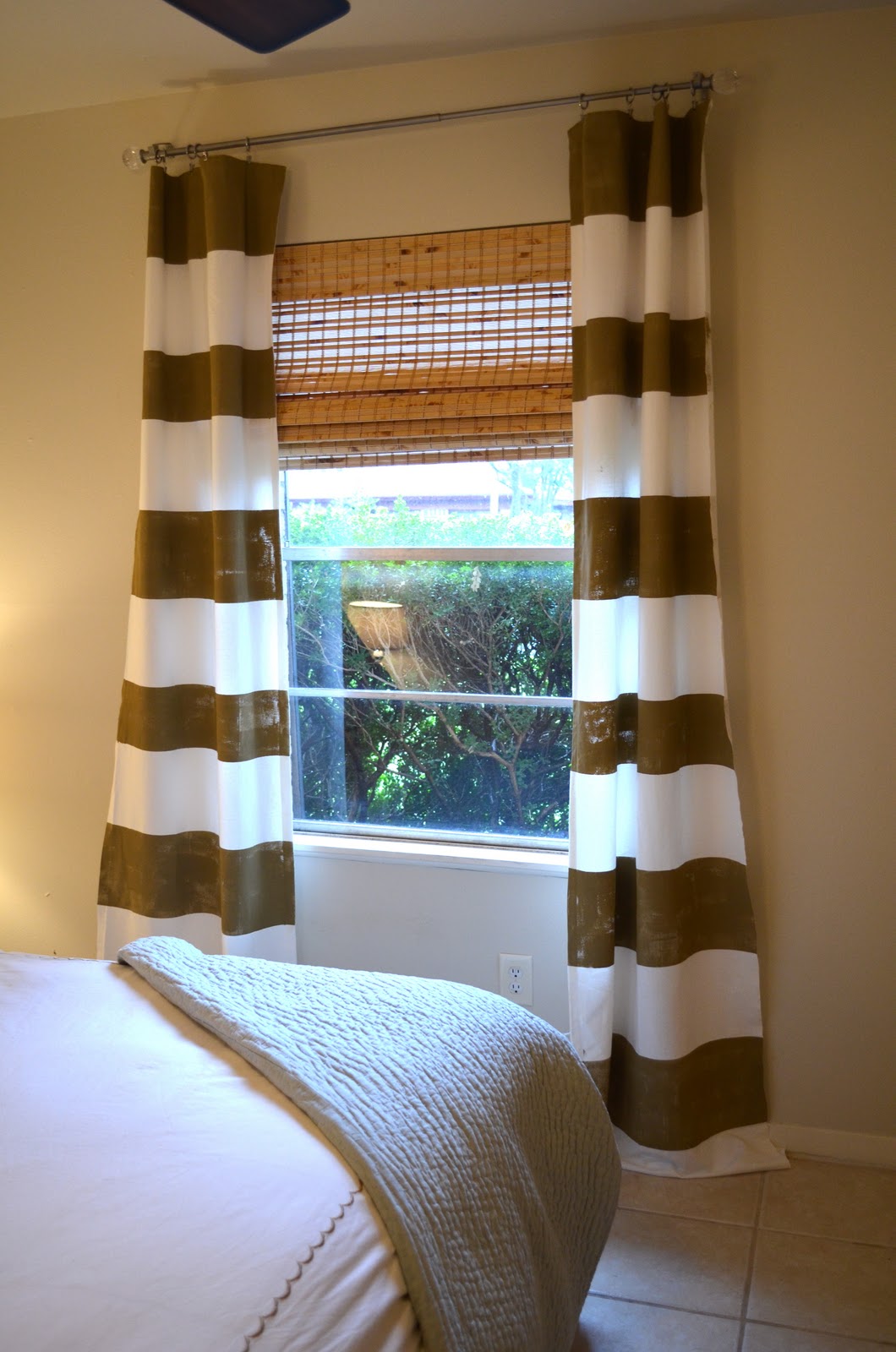
To give the space added drama, we replaced the horrible mini-blinds with a natural roman shade and flanked it with these striped curtains.  To make our low ceilings seem grander, I hung the curtain rod closer to the ceiling and to make our one window seem larger, I hung the curtain rod 12 inches wider than the actual window.  This way the curtain don't actually block any of the window so that all the natural light can still come into the room.  Since I already had a pair of plain white Ikea curtains that weren't being used, I decided to make my own curtains.  I've always loved Courtney of (A Thoughtful Placedining room curtains, so I used her curtains as my inspiration.  And then I found this fabulous tutorial from Dear Lillie on Pinterest, which allowed me to make my own! Since I already owned the curtains and curtain rod, the striped curtains only cost me about $9 to make ($6 for painter's tape and $3 for a jar of sample paint).

Sourcing
Large Throw Pillows - Steinmart
Oblong White Throw Pillow - Target
Supplies for the headboard - Lowe's 
Fabric for the headboard & dust ruffle - Interior Fabrics
Small mirror above bed - Hobby Lobby with 50% off coupon
Bedside table corbels & paint - $15 Lowe's
Art prints above bedside tables - Jones Design Company
Curtains - Ikea
Curtain Supplies - Lowe's
Lamps & Lampshades - Lowe's
Lampshade trim - Joann's
Ceiling Fan - Lowe's

Wednesday, January 25, 2012

Before & After - The Office Area

Why "office area" rather than just "office"?  Well, like most smaller, older homes, our's has a few quirky areas, one of which is adjacent to the kitchen.  Originally we had a huge, ugly, scarred deep freezer placed there, but eventually I convinced my husband to part with it.  Then we bought these industrial shelves to serve as extra storage, which were functional but not very pretty.

When we put our house on the market, the home stager said we should make the area into a breakfast room.  I scouted out a cheap table and chairs set and put them in.  It definitely looked better (still not great though), but it wasn't at all functional for us.  We literally never used the space.  As soon as we took our house off the market, I listed the table set on Craigslist.  (Also, please notice the random single lower cabinet that is to the right of the door.  As if that weren't bad enough, whoever last remodeled the kitchen, also slapped up a huge laminate backsplash.  Say whatty-what?!?)

And then we were left with this random unused space...which we turned into a tiny office area.


First off, we removed the unused lower cabinet and backsplash to open the area up.  Since there isn't a window along the back wall, that area doesn't seem light and bright.  To combat that, I hung three door mirrors horizontally.  The mirrors reflect the light from the kitchen to brighten the space and add some interest along the wall.  The best part - I bought the mirrors at Target when they were having their back to school sale so the mirrors were only $4 each.  $12 for a focal wall - check, check, and check!  Now the space is functional and pretty.

Tuesday, January 24, 2012

Before & After - The Family Room


The original dining room featured a wall of cabinets, built-in bookshelf, exposed cedar beam and fake-slate linoleum tile.  Hardly charming, and not terribly functional or attractive.  
We tried our best to make the dining room presentable, but it was a space that never seemed to work well for us.  We always found it odd that such a small house would have such a large dining room...
and that's why we turned it into our family room!


 We ripped out the lower and upper cabinets to create a space for our TV and Finley's books and toys.


We opted to keep the built-in bookshelf because it was actually useful.  To add a little pizzaz to it, I stenciled this design (free courtesy of Jones Design Company) along the back of the bookshelf to mimic wallpaper.  All in all, the stencil project probably took around 3 hours, which was time well spent in my book.


 We painted the beam to help it blend in a bit better and we ripped out four (4!!) layers of linoleum and put down wood floors.  Looking at the floors still makes me a happy girl!  In addition to ripping out the cabinets on what is now the TV wall, we also ripped out a very randomly placed lower cabinet that was to the right of the sliding glass door.  My orange reading chair is now in its place.  


Here is the view of the room from the kitchen.

Monday, January 23, 2012

Before & After - The Bathroom

Who doesn't love some good before and after pictures?  I thought we'd start the house tour off with the smallest room in our house - the good, old bathroom!

 Here are the two wallpapers in the bathroom...whoever put them together has to be color blind!

 Gray tile on the floors, walls and in the tub...and what bathroom wouldn't be complete without a brown shaggy toilet seat cover?!?  I wish I had a better picture of the entire bathroom because it was a sight!  It had a large, three-mirror medicine cabinet that took up the entire wall above the sink and it also features a row of huge globe lights, a la Hollywood make-up mirror light.  Yikes bikes!

The bathroom now!  Out of any room in the house, the bathroom got the biggest overhaul.  It was taken down to the studs and re-built with all new things - the only thing we kept was the pedestal sink.  

 We opted to get rid of the glass door in favor of a shower curtain.  When you only have one bathroom, it's nice to be able to hide all of your family's many shower and bath products.  I tried to keep the room fairly neutral with an array of whites and tans, drawing inspiration from this Crate & Barrel shower curtain.  

 Probably my husband's favorite part of the room - the larger shower head that was raised so that his 
6' 4" self can easily fit under it.  


To keep things simpler, we used the same tile on the floor and for the bath surround.